
Frederic Berghmans

Company: Bitcoin Suisse AG
Role: Project (UX) Lead, Researcher, PM and Design sprint facilitator
Duration: 5 Months (May 2021 - Aug 2021)
Bitcoin Suisse is the leading cryptocurrency broker in Switzerland with around 200 employees
Bitcoin Suisse wants to expand its product offering with a mobile app focussing on their existing customers.Clients ask for on the go and easy trading while upholding the sense of security of our platform.
1 Project manager, 2 React Native Developer, 2 Designers
I was the design lead on this project:
In order to stay competitive in the market and create product market fit, our current customers expect a native, fast, secure and portable mobile first app.
In 2 years time, we want to be the go-to mobile app to buy crypto in Europe. We want to have the most community-friendly, versatile, dominant crypto product suite.
Update 2023: While the objective bove was set in the beginning through a design sprint, the company changed strategy in the meantime to not focus on retail clients anymore. As we deal with high net worth individuals who demand this premium experience, the objective or value proposal still stands.
💡 Learning : We re-evaluated the experience, more retail focussed features were scoped to be for a later point in time, so the fact that we prioritised building the basics really helped us not spend time on things that we would have to throw away.
We validated the idea of having a mobile app in the app store by implementing a wrapper around the current responsive website. We quickly found that after one month over 60% of traffic was coming through the non-native app (wrapper). We can only increase satisfaction of these people by offering them a mobile first native experience.
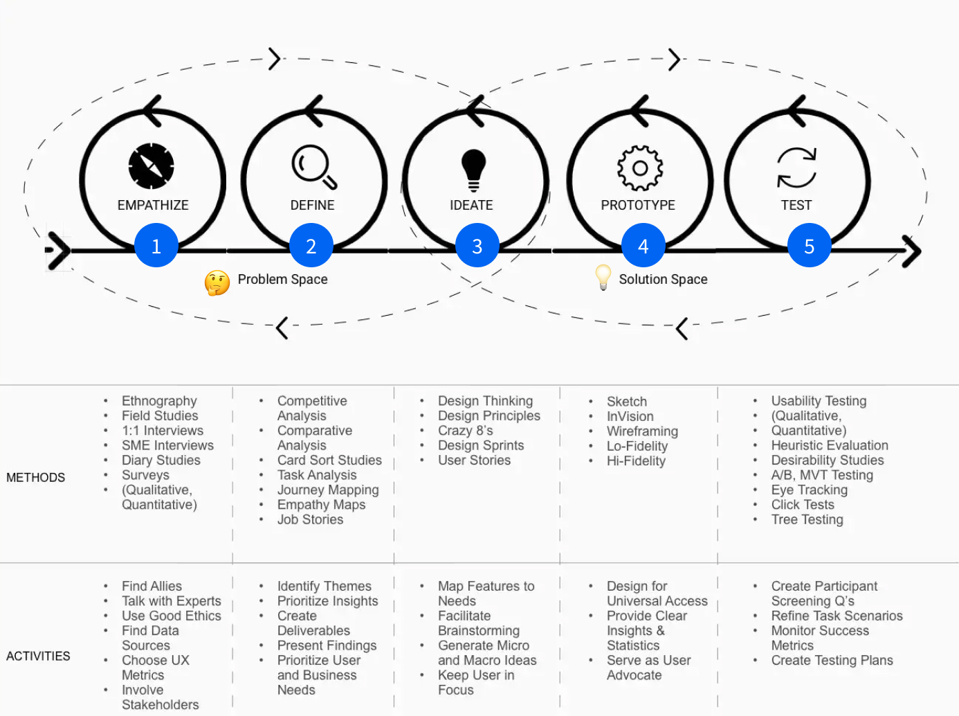
I Introduced the following process into the company based on the design thinking methodology, this then got tweaked towards a process that suggests the following methods in each phase:
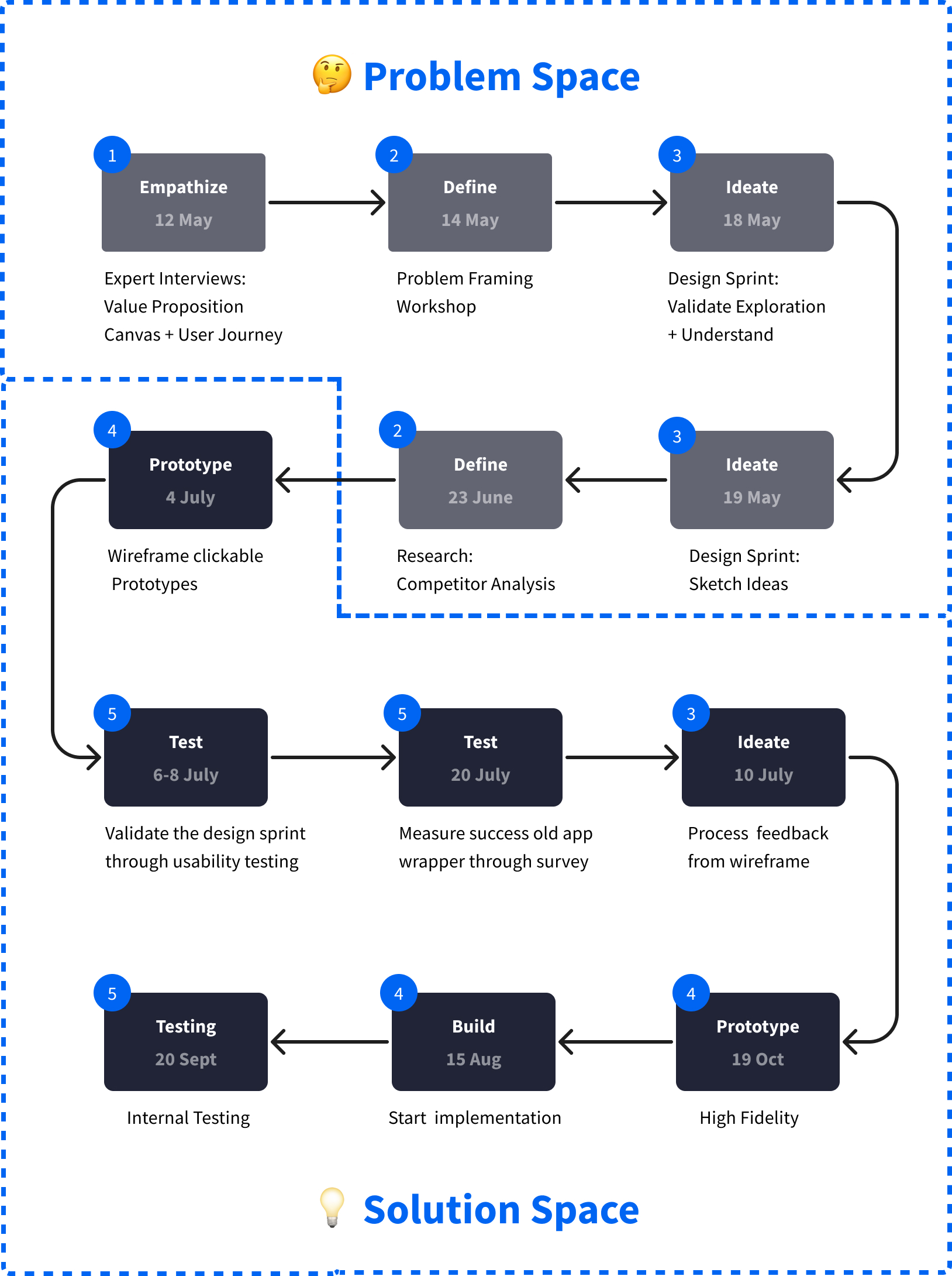
Using the design thinking methodology we jumped back and fourth between phases in the problem space, to then focus on the desired solution.
Performed expert interviews beforehand to get an understanding of the status quo , mapping out findings on the value proposition canvas (why focus on customer jobs, jbtd?) and the user journey of the people we are trying to target. The remaining phases in the journey would be later opportunities.
This would form the perfect foundation for the design sprint so we can quickly validate this with the people in the room.
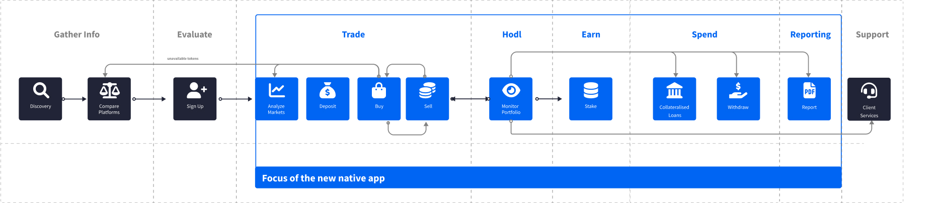
> Check out an in depth overview of the Private Individual user journey
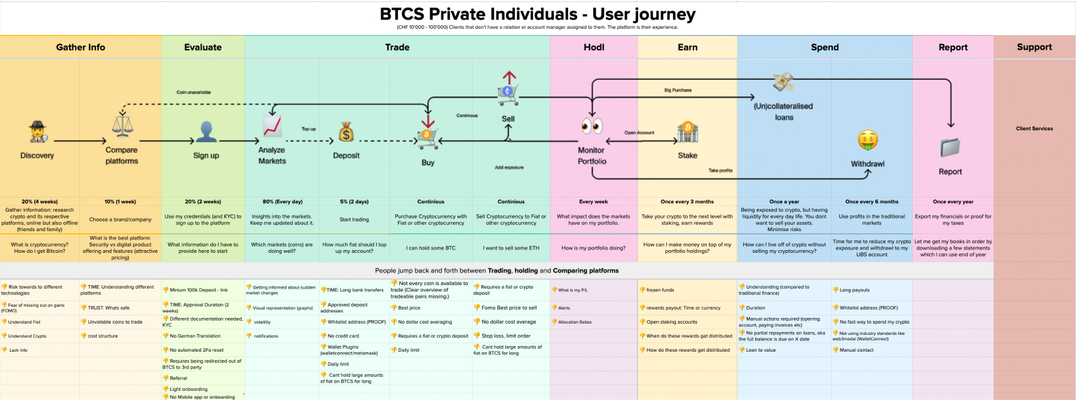
fig: Private individual user journey (+ opportunities) I've made
> Check out the value proposition canvas
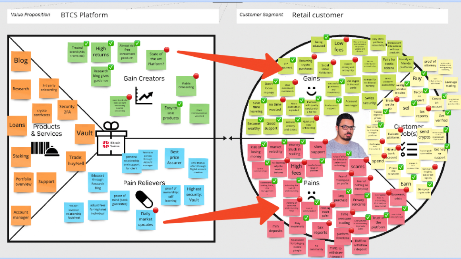
fig: Unvalidated value proposition canvas I've made
👍
👎
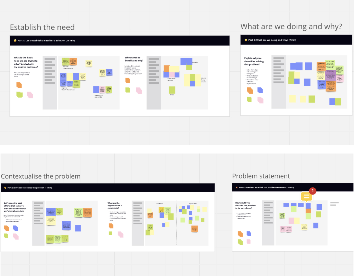
Facilitated a remote problem framing workshop in Miro with key stakeholders in the company where we defined the challenge we want to tackle with the mobile app and who we are building this app for. Inspired by a template from Prime Motive
A 2 day design sprint where we first (Mon 17.05) got close to understanding our users and their needs, next
(Tue 18.05) we presented new ideas and aligned on a concept.
We are using the design thinking methodology to start off this new project. Why? In a few short days, a Design Sprint will lead your team to the creation of a rapid prototype that you can test with your users and get immediate feedback. Took inspiration from the Design Spring 3.0 and AJ&Smart Design Sprint 2.0
Applying the Double diamond process: where two basic steps of a creative process are used: Diverge and converge. For a creative session we add a clustering phase. To create an overview for the team. We rinse and repeat this throughout the design sprint
The entire sprint was put into a report in case anyone wants to look at our results in the future.
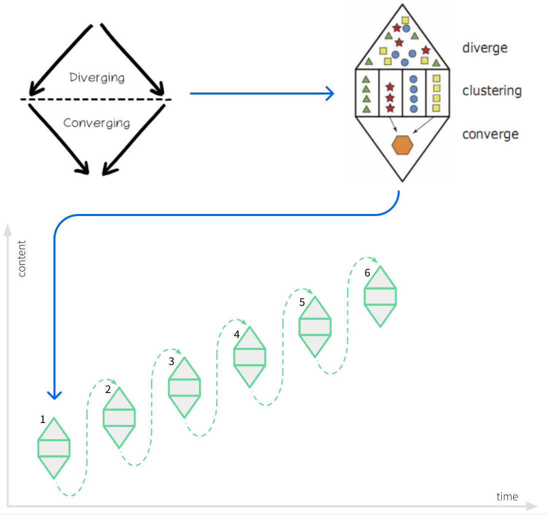
fig: The Diamond thinking methodology, we used exercises that would build on top of the next one.
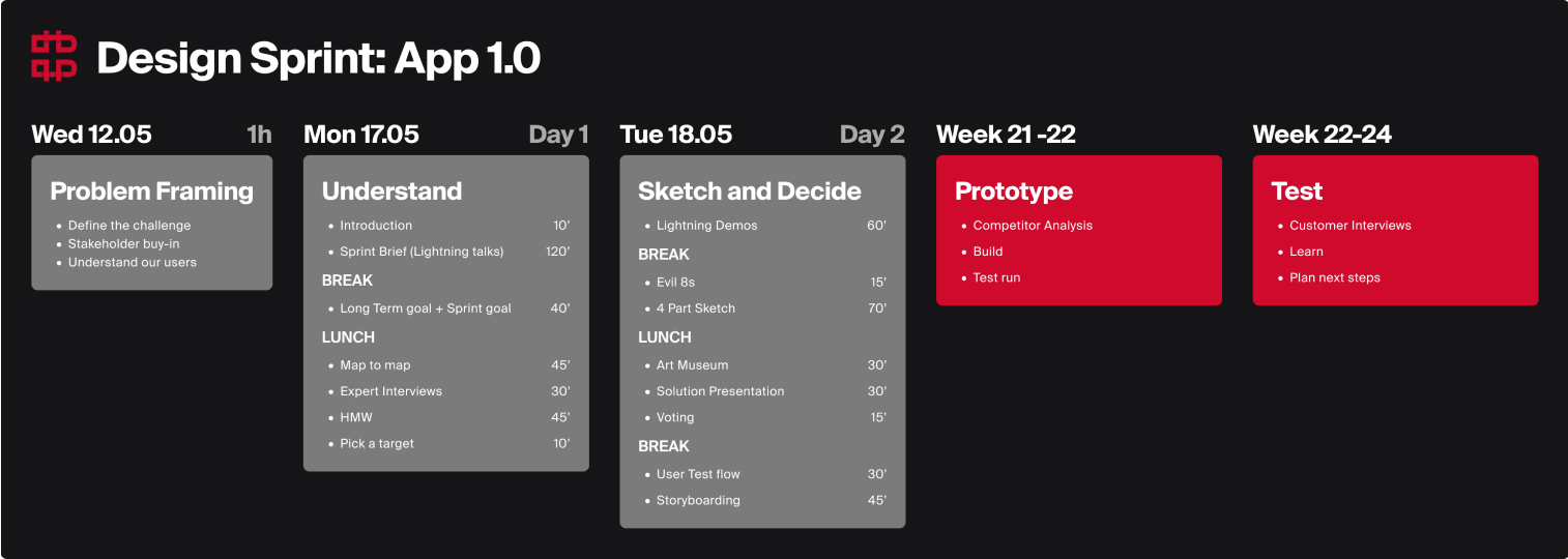
fig: Due to budget constraints we could only host a one day workshop
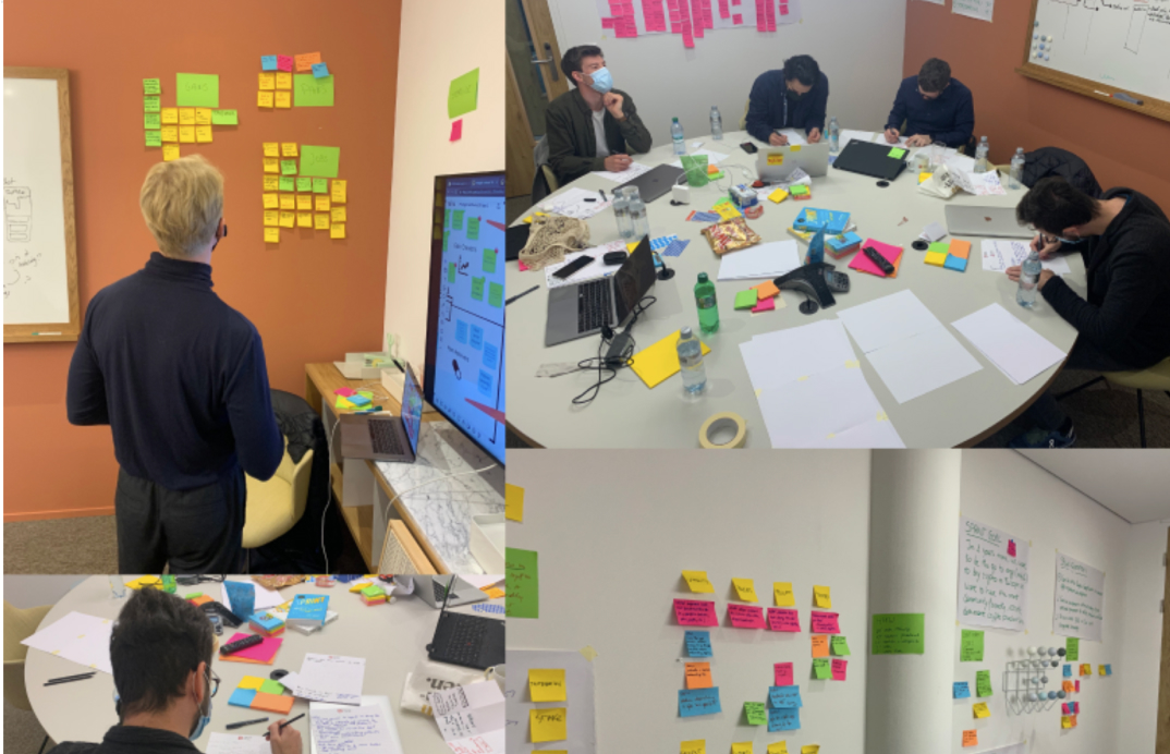
fig: Images from the workshop - PO, Dev , designer and architect.
I wanted to find a way to validate on which apps to focus on and consider ‘best in class’ and the market reacts well to. I created a list with the top competitors and their app store ratings...
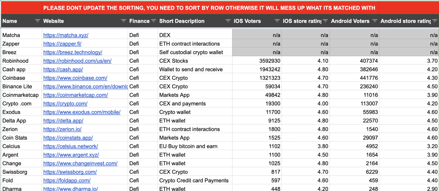
Next, I performed competitor analysis where I took a look at how the competition solves certain patterns mapped on the customer journey, we will use the initial prototype from the design sprint together with the competitor analysis to come up with a clickable prototype to test out with users.
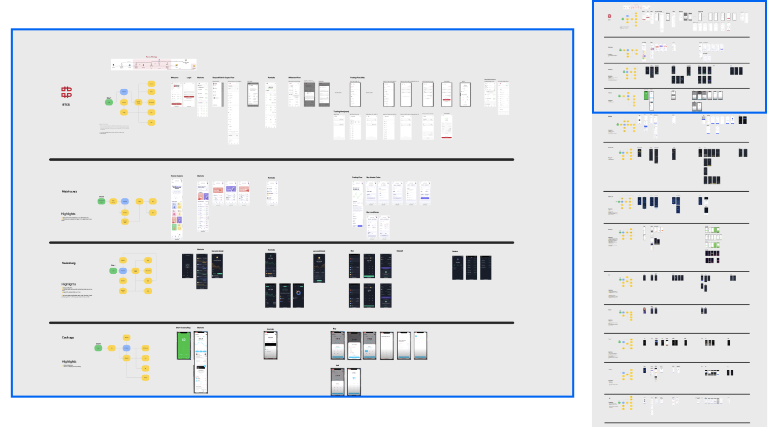
fig: An overview and list of competitors to compare user journey and user flow
Based on the above foundation, it was time to create wireframes.
Started off and used whimsical to not be bothered with components and UI elements: Focus on how stuff works not on how stuff looks. Guided the stakeholders and set up 2 rounds of feedback.
Exported the screens as jpeg’s to Figma and added touch areas to turn into a clickable prototype.
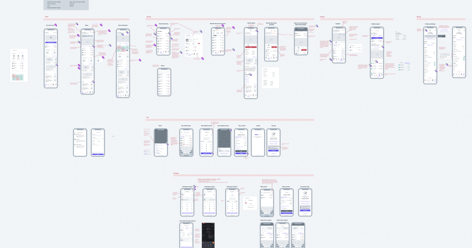
fig: First iteration of the wireframe
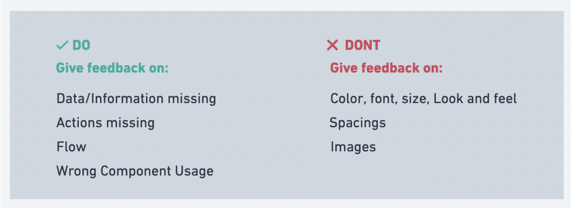
I realised that having a clickable wireframe in Figma is the perfect level of detail to test out with users. The only challenge is that you need to prime them about the level of detail (what is a wireframe) and why its not branded.
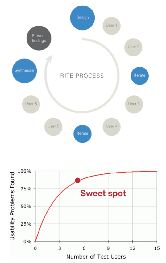
I used the RITE method where I created a prototype, tested with one or 2 users, iterate and test again with 2 users with the new concept the next day. This made us move quickly into the next phase.
💡 Tip: Jakob Nielsen recommends doing usability testing with 5 participants
Testingtime allowed me to recruit and mimic our existing customer base by demographic and filtering through pre determined criteria that would on paper be the same person as our customers. The participants didn’t know the company I was from.
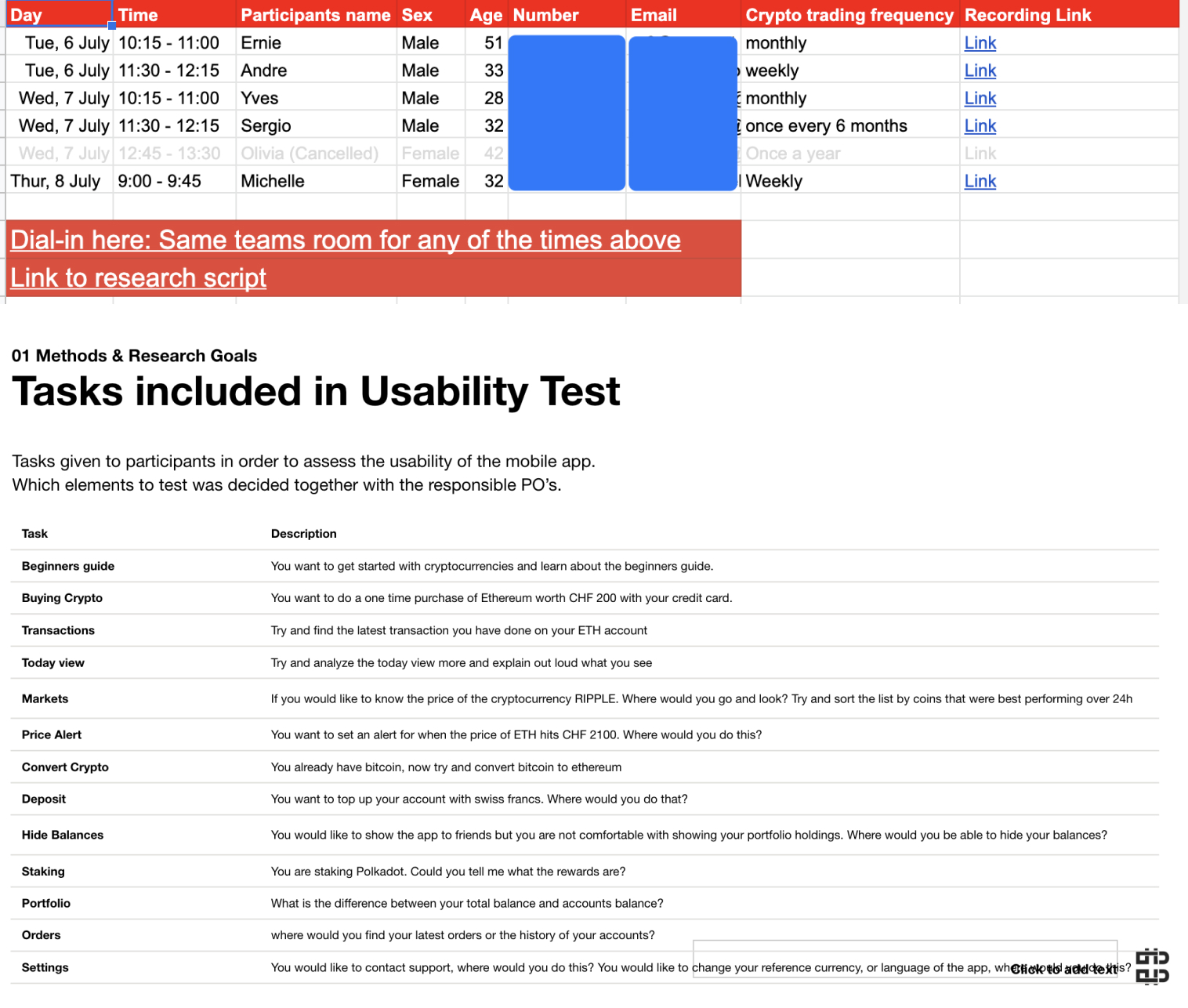
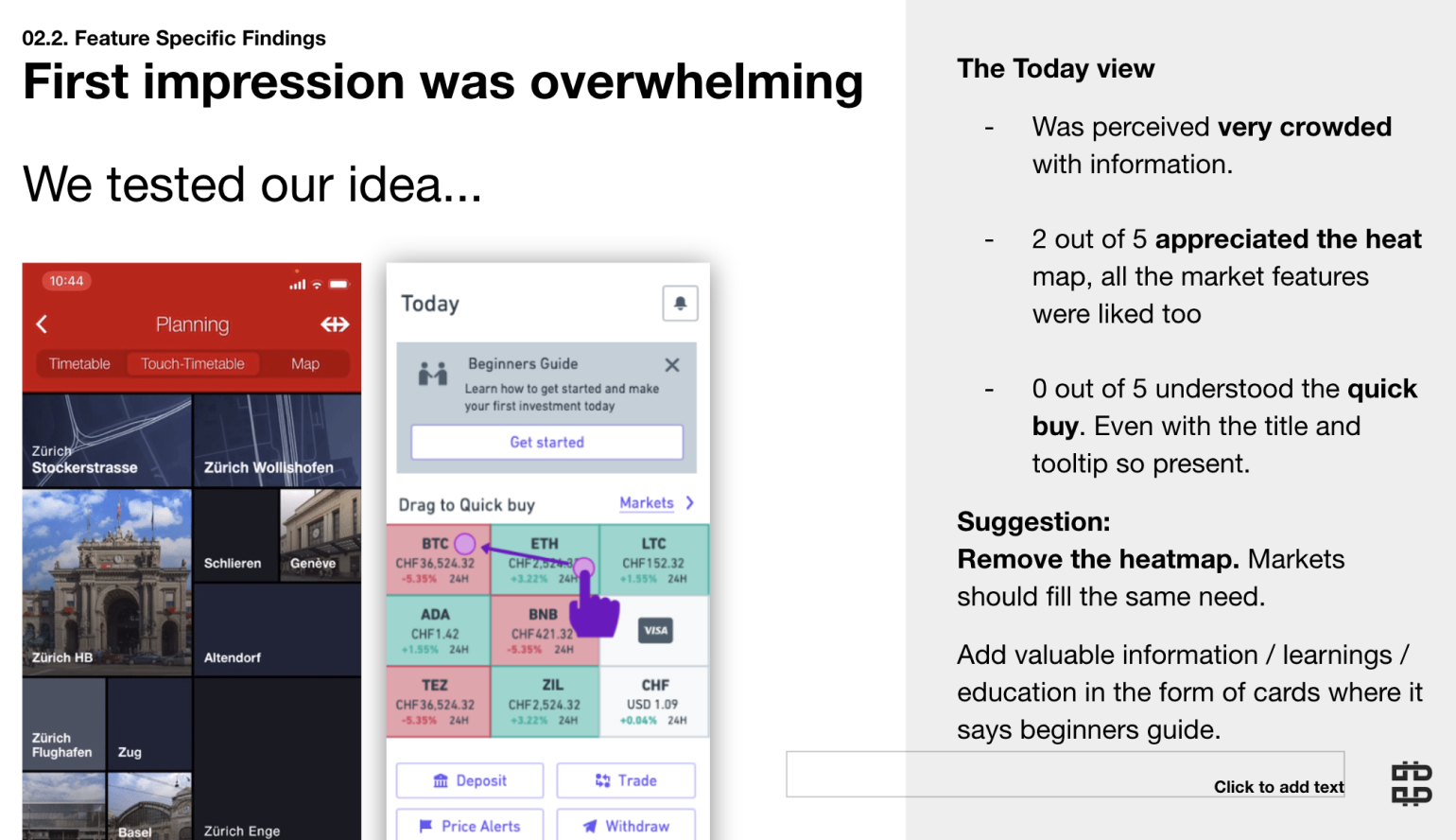
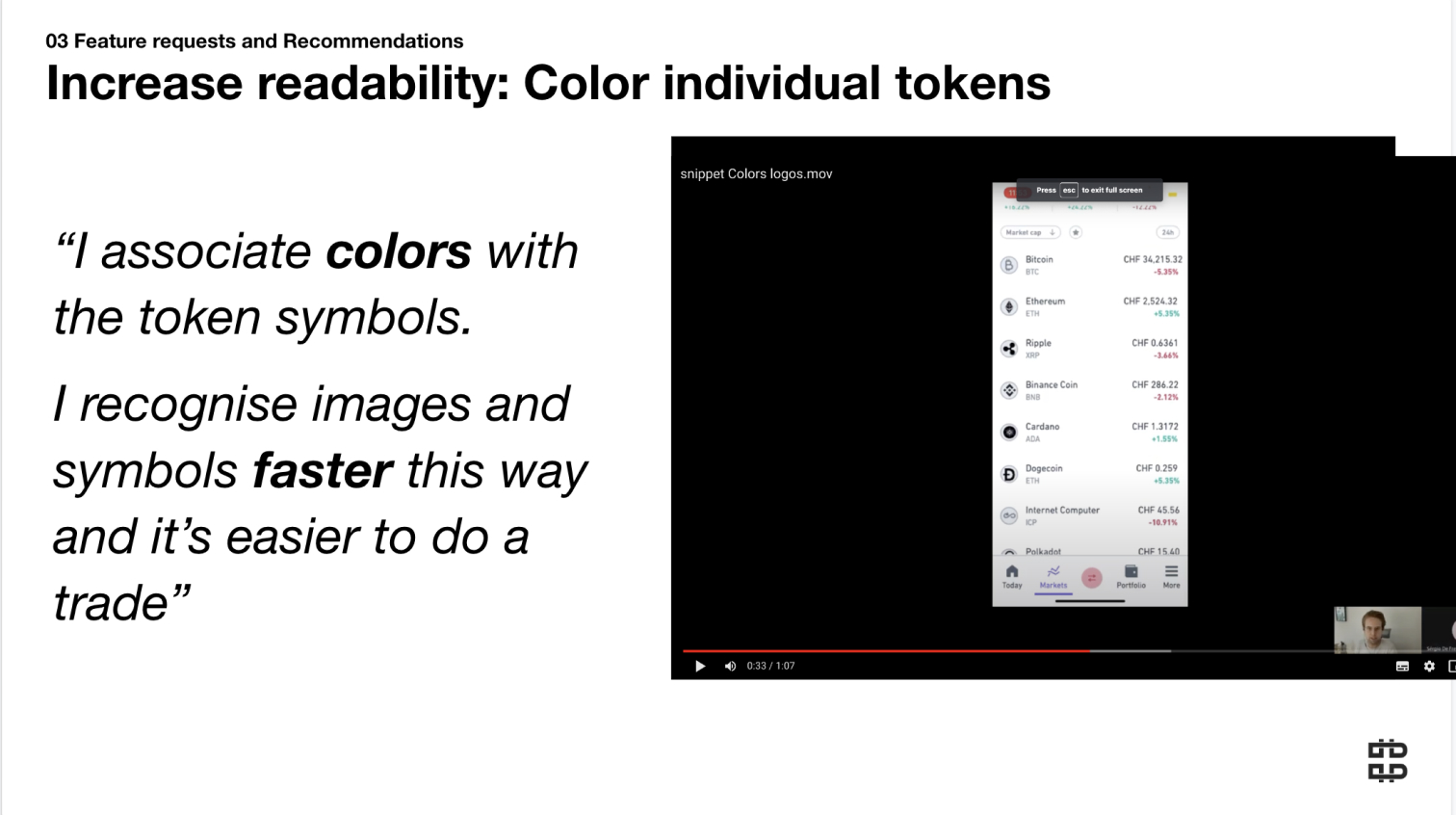
fig: Showing video snippets to our internal stakeholders made things very tangible and easy to remember
As we have launched a webapp wrapper a few months before starting this journey, its important to measure afterwards if we released an improvement compared to this wrapper version.
Creating a survey that would help us get a baseline idea will help us to advocate more for this way of working and advocate for design sprints in the future.
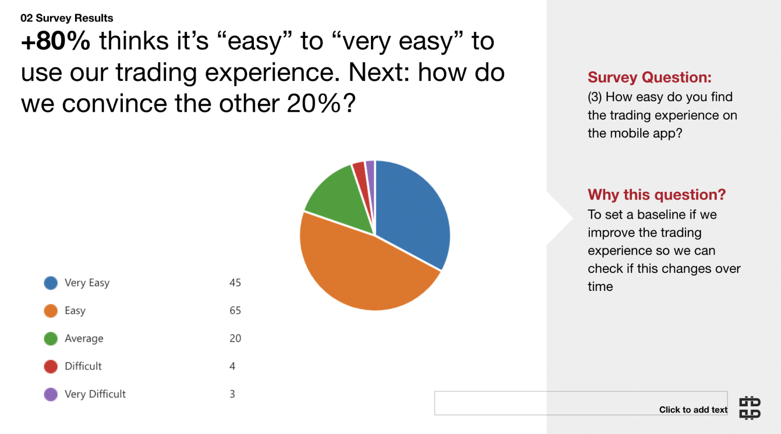
fig: Seems like a mobile app is definitely something people care about so improving this will be heavily appreciated.
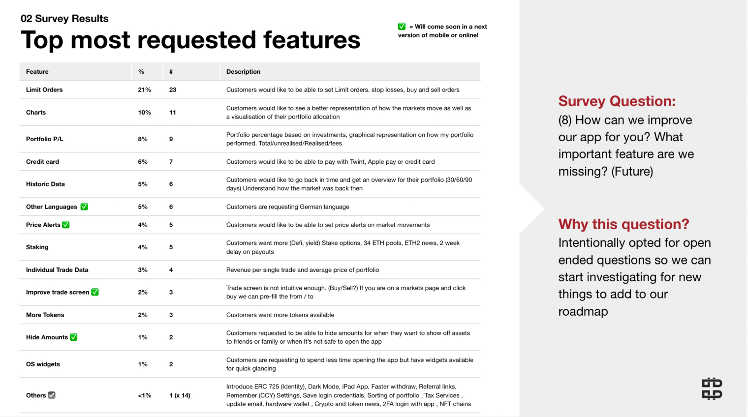
fig: Additionally this allowed us to ask and create a roadmap of the next things people want to see
Now that we have:
There is only one thing left and that is creating high fidelity prototypes which is in line with our internal design system.
Why did we leave this for the final step? Several reasons:
The Art Director / UI designer can now take all the time he needs to battle test designs and come up with a proposal for the brand. I did an initial (v1) proposal but he needed to have a final redo. (v2)
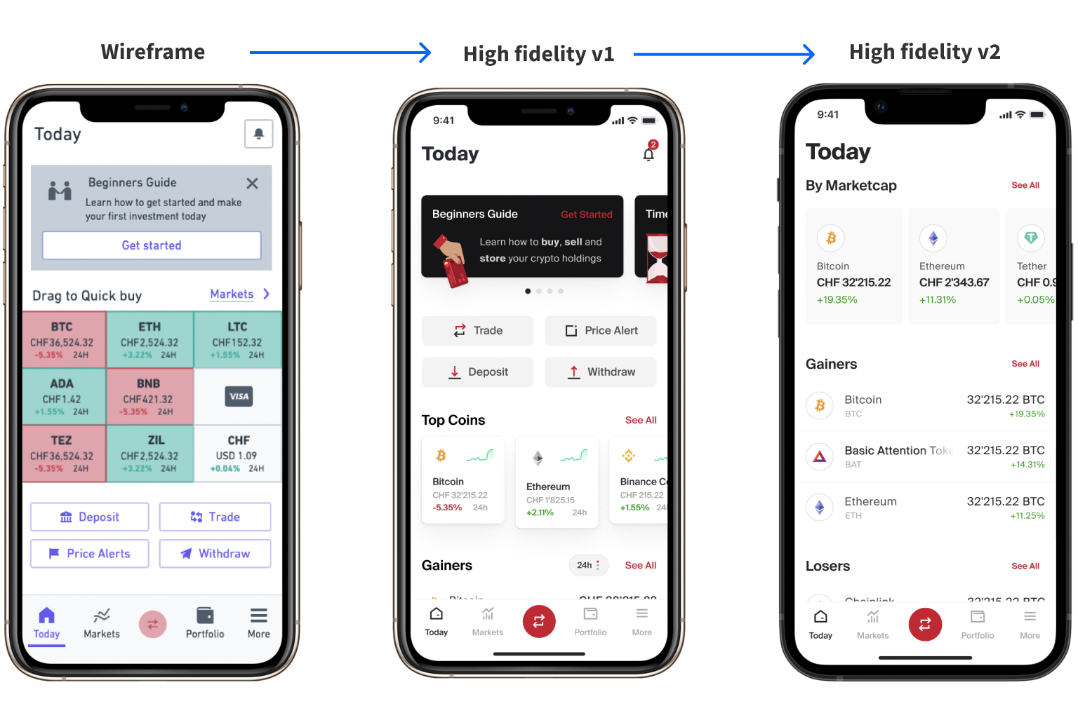
fig: The below is a clickable prototype
fig: The below is a clickable prototype
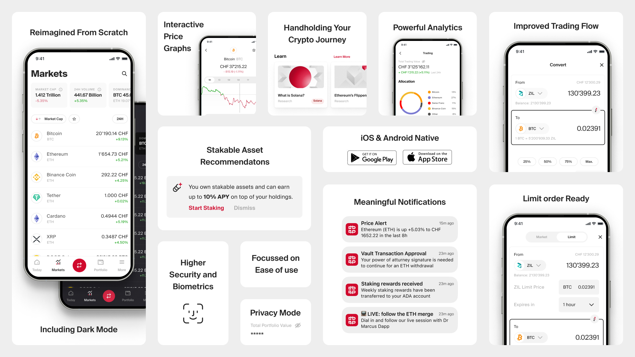
We had several discussions on which technology to use and we ended up using React Native.
The reasons why we settled for React Native was:Its cross platform, with limited resources we can build for 2 devices.Coinbase announced it had just transitioned to react native.Recent Proof for why it was a good idea to choose for React Native (Shopify)
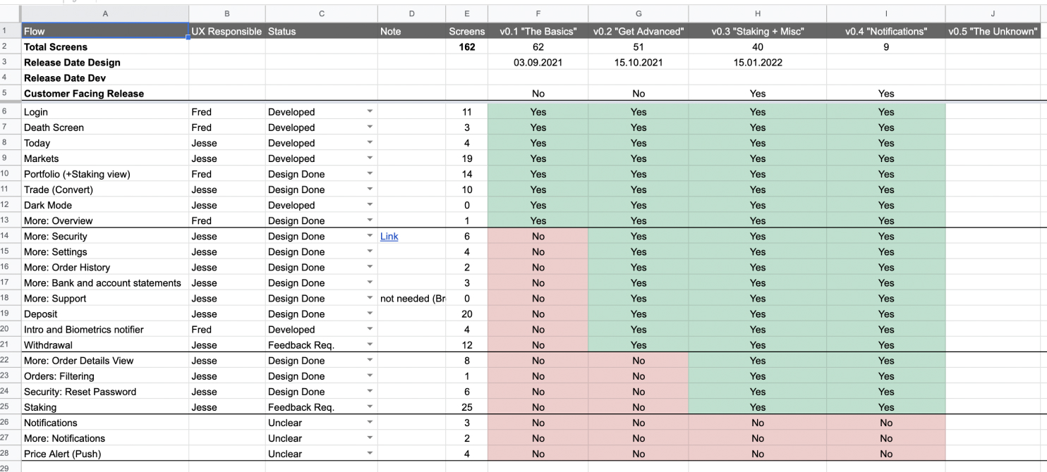
The team needed help on how to split up the app and create value in iterations. I Assisted the PO of the project and did a proposal on how we could release internally and test while having a concrete plan on how everything should fit together.
The launch of the app was a success, we saw an increased shift from desktop usage into the mobile app.
Internally stakeholders were doubting of the importance but they heard live and through customer surveys from customers how happy they are with the changes we have made.
Its important to note that this app fundamentally positions the company well compared to the competition in Switzerland. This move from a webapp provides the company with a lot of flexibility to build more features on top which will increase retention and satisfaction even more and will eventually leads to revenue (as per McKensey)
The following metrics were as of June 22
Increase in trade completed
Customer Satisfaction
Increase retention
After we had the validated clickable prototypes, we had several UI related discussions on whats the best solution. I introduced the data driven approach and we ended up using Usability hub to look at results.
Use every opportunity to advocate for design. When thinking about how you can translate design efforts , design sprints and satisfaction into business value really helps you to train your audience and will get buy in for the next time
Don’t be married to your design or your solutions, the company changes and you need to adapt. This app started off with the focus to be for Private Individuals but ended up for High Net worth Individuals and institutionals